digital
Depaul University
DePaul rebranded and needed flyers, wordmarks, and packaging to be redesigned to fit the new guidelines.
here's what i came up with:


wordmark(s)
"a distinct text-only typographic treatment of the name of a company, institution, or product name used for purposes of identification and branding"
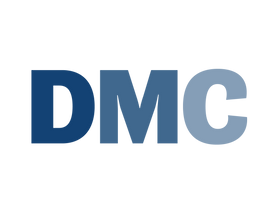
after a University-wide rebranding initiative, departments within DePaul needed redesigned wordmark that followed branding guidelines using three colors and one font.
each department wanted a different feel and wondered how unique could a word really be with these constraints?
the answer: pretty funky


flyers + posters + more
working with different teams to establish distinct tones from professional to welcoming, i used the two fonts and three approved colors to the max in poster and mailing material


DMC launch + convention
after designing the wordmark and building the DMC identity, the University affiliated collabrative was ready to host its first event and needed modern, gentle feel for its brochure, slidedecks, and promotional materials that still adhered to the wider University guidelines.


packaging
a slick unboxing experience sent to trustees and board members to show the intellectual achievements of students within the LAS program paired with fun, collectible buttons which speak to the creativity of the students